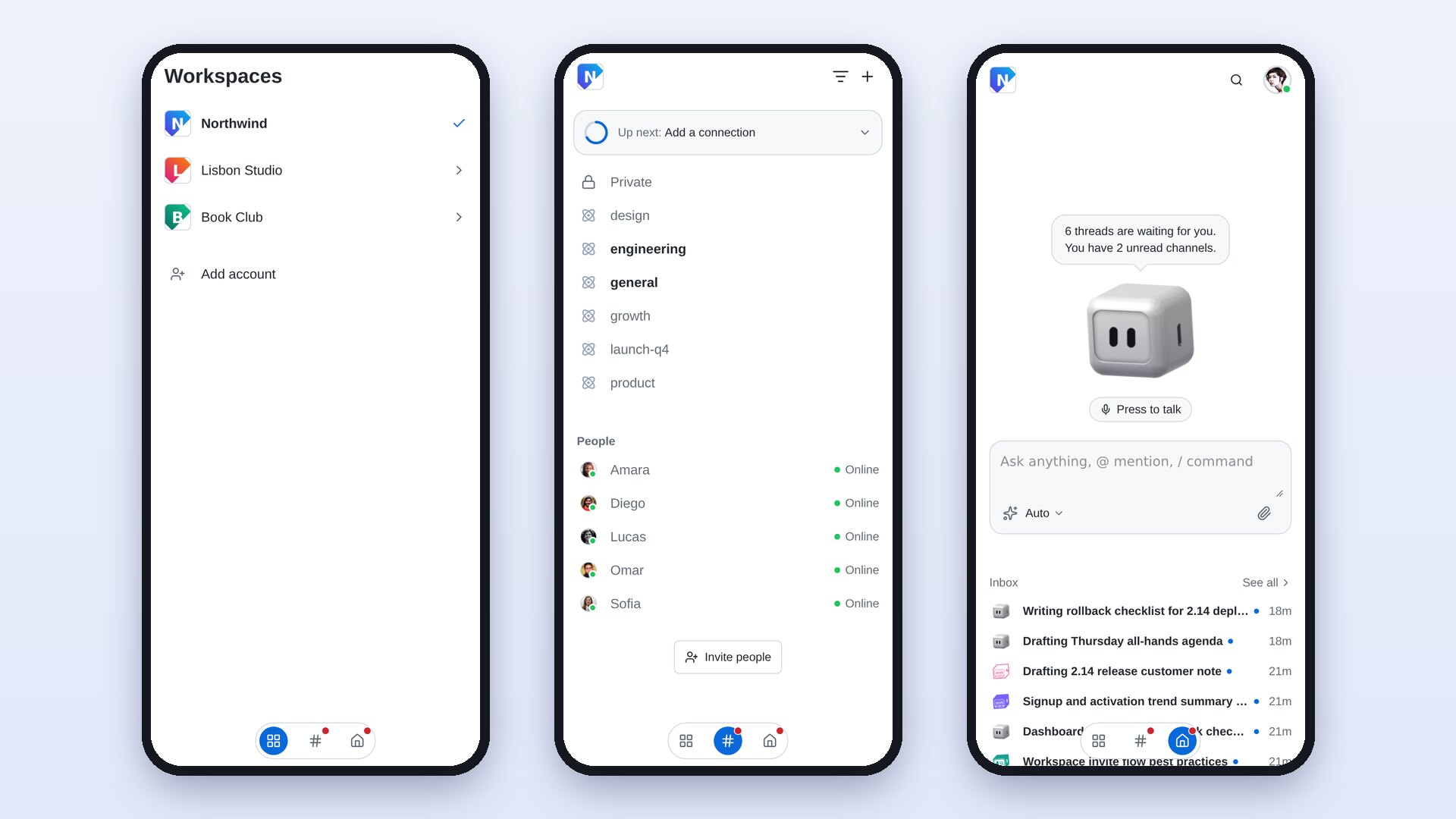
What changed
Home on your phone is now one screen with three pages side by side, and the bottom bar is gone.
- Home is where the app opens. Nebula and the message box sit at the top, and your whole Inbox scrolls underneath as compact rows. See all opens the full Inbox.
- Swipe right and you're on the Channels page: every Channel and every person in the workspace, in one list. It replaces the old Channels and DMs tabs.
- Swipe right again for your workspaces. Tap one to switch to it. Add account is at the bottom.
A small pill at the foot of the screen shows the three pages: a grid for workspaces, # for Channels and a house for Home. The open page sits on a blue circle that follows your finger as you swipe. A red dot marks a page with something unread: the Channels page while a Channel or DM is unread, and Home while the Inbox has an unread thread that has finished. Tap any icon to jump straight to its page.
The top bar on Home is lighter too: just the workspace icon, search and your avatar.
How it works
- Open the Nebula app. You land on Home, with your Inbox under the message box.
- Swipe right anywhere on Home, or tap the workspace icon in the top corner, to open the Channels page.
- Tap a Channel to open it. When you go back, you return to the Channels page, not to Home.
- Swipe right again to see your workspaces, and tap one to switch.
- Swipe left, or tap the house in the pill, to get back to Home. On Android, the back button on either side page also takes you to Home.
Links that used to open the Channels or DMs tab now open the Channels page. Inside a Channel, the Chat, Threads, Calls and Apps bar is unchanged.
The new Home is in the Nebula app for iPhone and Android on phone-sized screens. Wider layouts, such as tablets, keep the sidebar they had.
Why it matters
Home used to be crowded. A short Inbox list sat under the message box, a four-tab bar at the bottom repeated the same counts, and Channels and DMs were two separate tabs. Now everything you check on your phone is one swipe from Home. The screen gives its space to your Inbox, and the red dots tell you where to look without a row of badges.